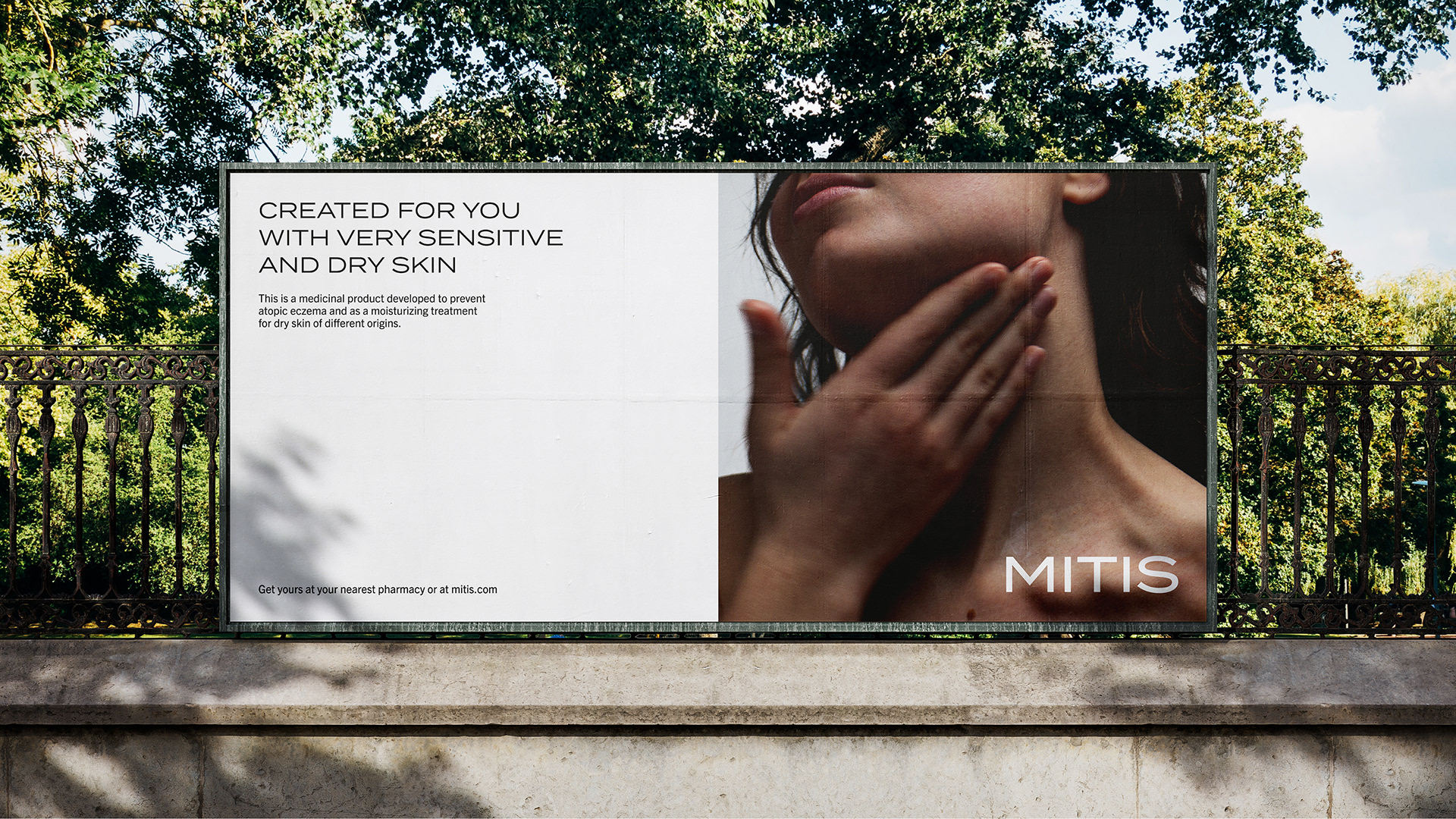
MITIS is a fictional brand that creates pharmaceutical body cream that feels a little less like your typical medicinal cream. My aim is that with packaging that feels more modern, exciting and fun than the standard today, you can make it feel less like medicine and more like your everyday skincare.
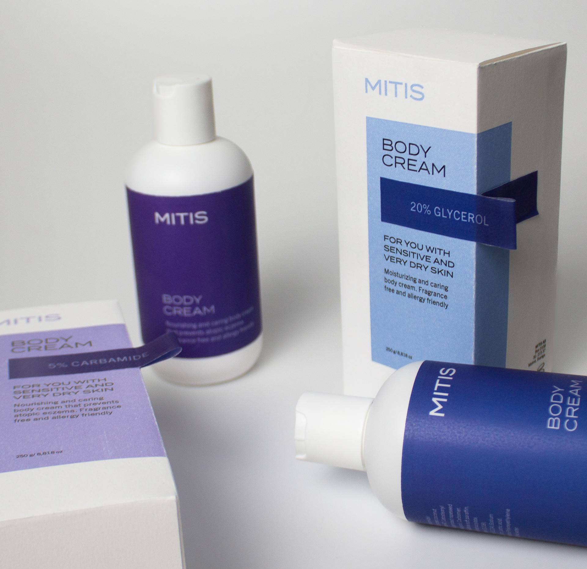
The name MITIS is latin for “mild” and it was the perfect name for this brand as it is the essence of this product. My goal was that it would feel like a safe and caring product for everyone to use, with a hint of elegance. The challenge for me with this was to find the balance, to create a more modern expression without losing the legitimacy of a pharmaceutical product which is very tied to the traditional medicinal packaging.
_
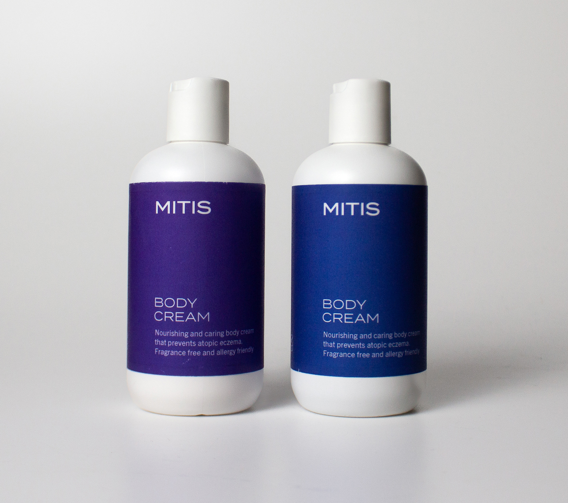
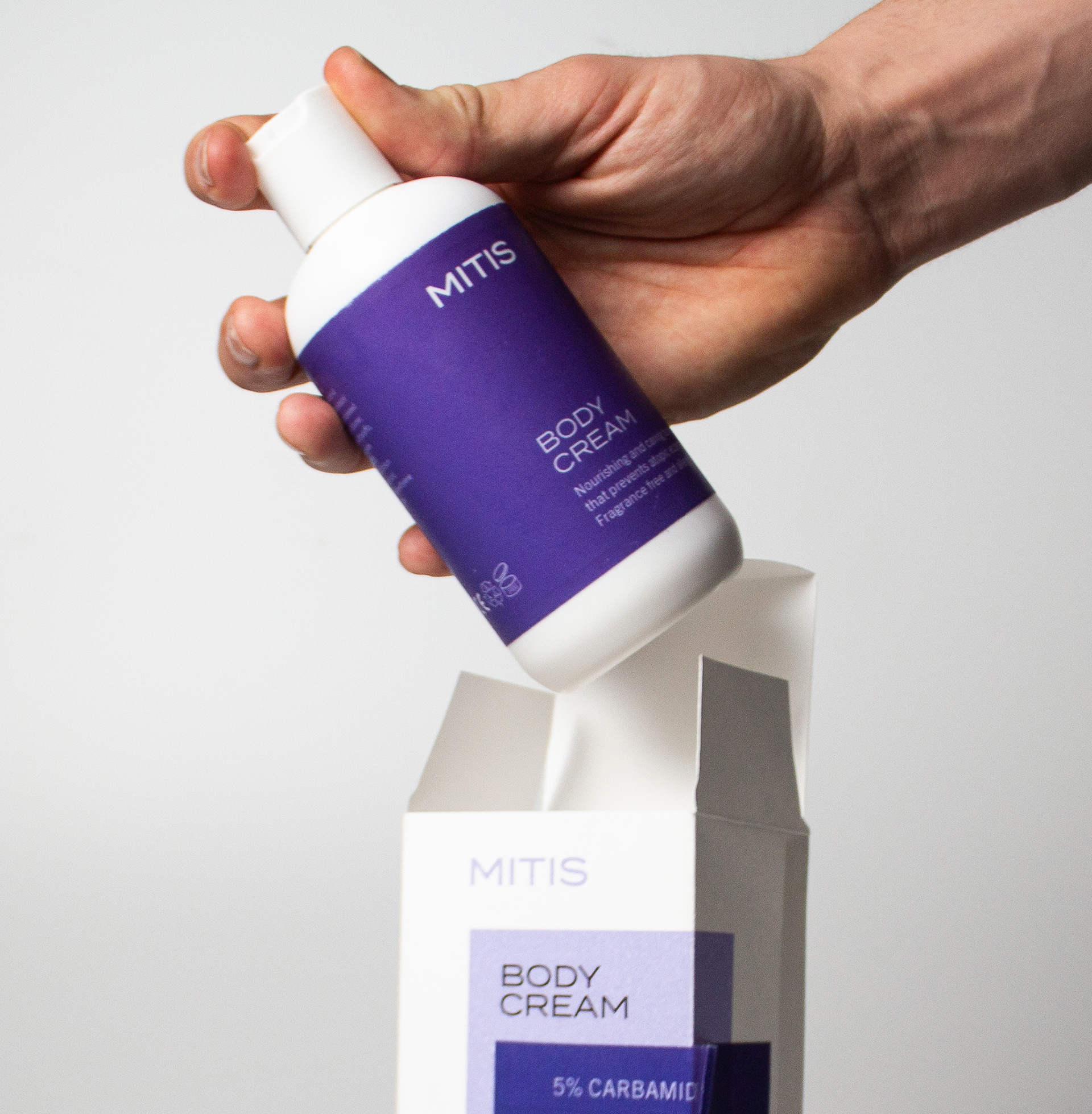
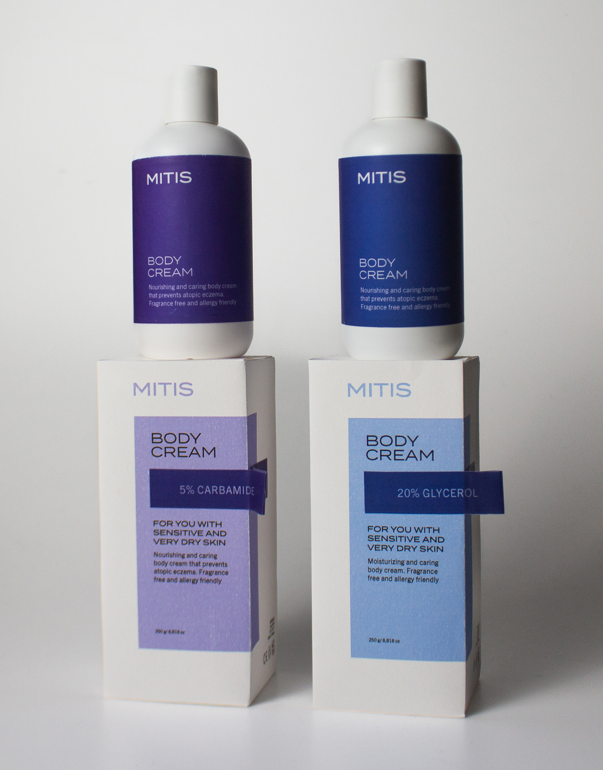
The exposed label is a cue to the label pharmacists stick to the package of a prescription drug as an indication that this is in fact a medicinal product. The color choices I made, blue and purple, were based on input from surveys where I found out that these colors communicated trust within this line of products, which was an important factor for me.
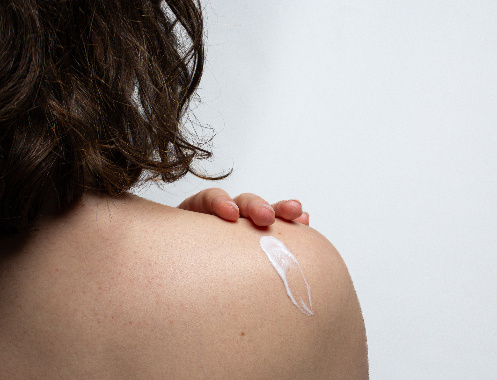
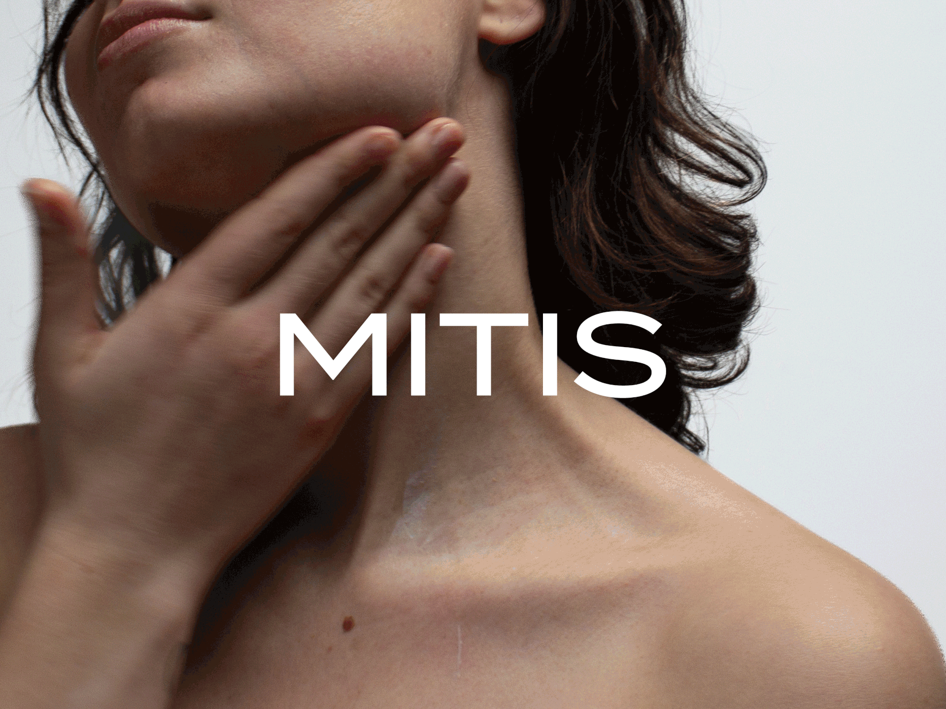
The aim with the branding imagery was that the skin itself should be highlighted and in focus. To attain that, I photographed the model in a studio setting with white background and worked with very hard crops of the images to really give the skin all the attention - just as the product does.
_